Email Composer
The Email Composer allows you to compose/design communication email to use in Email Node. These emails templates are used to increase the efficiency of the email communication set-up process.
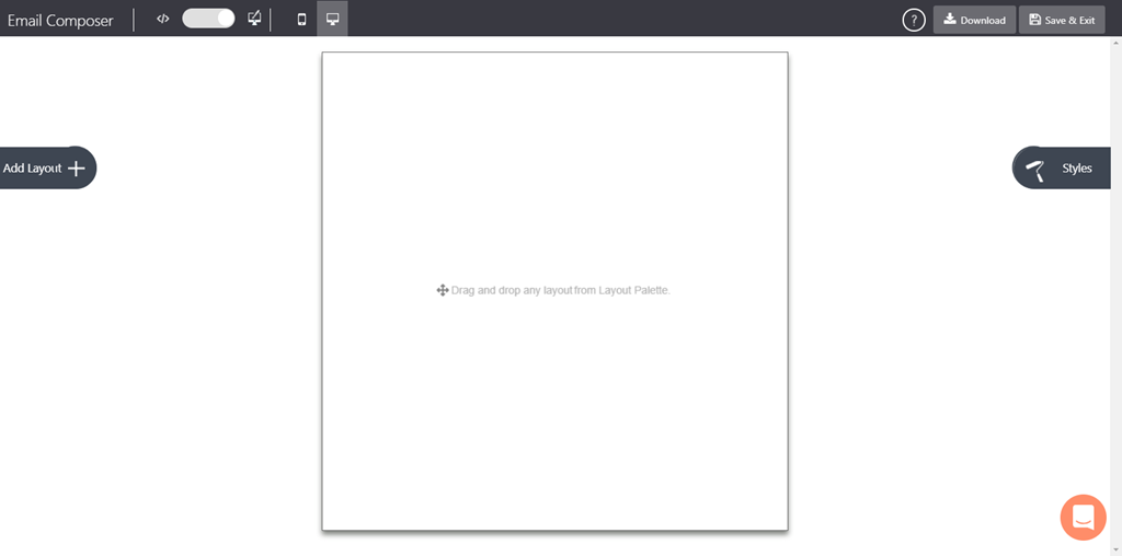
The email composer is a comprehensive and intuitive layout to design email templates. It allows you to create, edit, view custom email instances and send emails via the Connect platform.
The email composer can manage the variables used in the instance. The output of the composer will be provided as HTML to Connect that will be passed to the SES API to send email to the recipient(s).
The Email Composer has the following section:
NAVIGATION PANEL
This panel enables you to create, view, and save the template. It also allows users to preview the created email in Mobile and Desktop environments.

| Icon | Description |
|---|---|
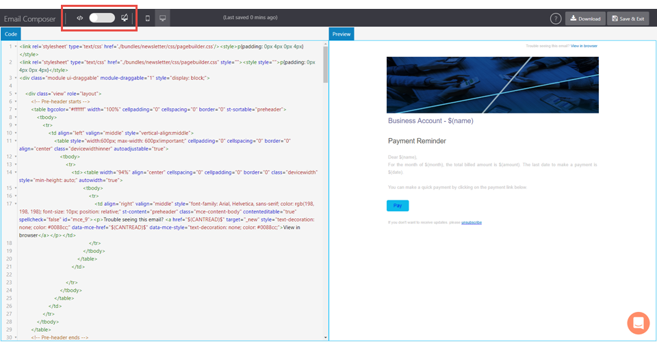
| Toggle the button to view the HTML code and the template (side by side.) | |
| Allows you to preview the email template in mobile/desktop view | |
| Allow you to view the Email Composer help content. | |
| Allows you to download the responsive template in HTML file format. | |
| Allows you to save the template and exit the composer. | |
| Click to view layout palette elements (Email Building Blocks) | |
| Click to view style palette elements. |
Adding elements on the canvas
- On the Email Composer dashboard, click Add Layout +
- Click and drag anElement from the Layout Palette on the email canvas.
- Configure and set the anchor properties.
- Hover on the element to view the configuration settings
- Click on an anchor to view the Style Palette.
- To complete composing the email, click Save & Exit on the top right corner of the Email Composer.
The template is saved and the application returns to the Template page
Delete/copy an element on the canvas
- Point your mouse on the right margin of the anchor you want to delete.
- On the right margin of the anchor, click setting icon.
- Click Delete to delete the anchor
- Click Copy to create a duplicate anchor. The duplicate anchor is added to the bottom of the source anchor.
Move the card on the canvas
- Point your mouse on the right margin of the anchor you want to move.
- On the right margin of the anchor, click and hold Move icon
- Drag and place the anchor at the desired location.
You have successfully moved the anchor to a target location.
Manage unsubscribe link in an email
- Open the email composer.
- Click Add Layout. The Layout Palette is displayed.
- From the Layout menu, drag and drop the Footer element on the canvas.
A text block with default text with a unsubscribe hyperlink is displayed. - Click on Unsubscribe text; the rich text toolbar is displayed.

- On the toolbar, click insert link icon to configure the Unsubscribe hyperlink.
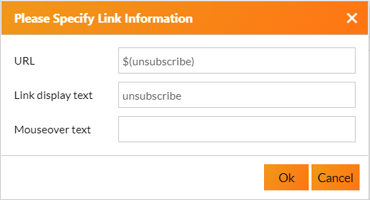
- Enter the hyperlink details. and click OK.
You are done with unsubscribe link creation.

| Label | Description |
|---|---|
| URL | Enter the URL of the hyperlink. This URL will open when a user clicks 'unsubscribe' in the email. |
| Link display text | This is the hyperlink text in the email. |
| Mouseover text | The text to display when the user hovers the mouse on the hyperlinked text. |
Add Layout (Palette)
The Layout Palette interface enables you to design a template by a simple drag and drop interaction. You can edit images and content with the help of an inbuilt editor. Following are the template elements and cards available in the layout:
| Element | Description |
|---|---|
| Pre-Header | A preheader is the short summary text that follows the subject line when an email is viewed in the inbox. |
| Header | Allows you to add an introductory content. |
| Banner | Allows you to add an image banner. |
| Spacer | Allows you to add a space between two elements. Click the spacer element on the canvas to open the Style Palette. |
| Button | Allow you to place a clickable button. Double-click the button element to configure the button. |
| Button & Text | Allows you to add a button(in the right) and a text box beside the button. |
| Title & Text | Allows you to place a Header and a text box below the header. |
| Text | Allows you to add a paragraph text. |
| Conditional | Allows you to create a conditional email based on the conditional criteria with the help of a conditional builder. Any number of conditions can be prepared based on the requirement. |
| Table(Textual) | Allows you to add a table to the template. |
| Image | Allows you to add an image. The image is justified to the content on the template. |
| Image(100%) | Allows you to add an image. This image occupies(100%) the total width of the template. |
| Image & Text (15/85) | Allows you to add image and text. |
| Image & Text (30/70) | Allows you to add image and text. |
| Image & Text (50/50) | Allows you to add image and text. |
| Text & Image (50/50) | Allows you to add image and text. |
| Imaged Button | Allows you to have a custom button (you can the image of the button to a custom image) |
| Image Card | Allows you to add a group elements consists of an image, a header along with a text box and a button( |
| Image and Button | Allows you to add a group element, an image, and a button. |
| Image & Caption | Allows you to add an image and header to add a caption to the image. |
| Image & Text | Allows you to add an image and a caption to the image. |
| Two Images & Text Group | Allows you to add two images, a header, and text to each image. |
| Three Images & Text Group | Allows you to add two images, a header, and text to each image. |
| Two Images Group | Allows you to add two image side to side as a group |
| Three Images Group | Allows you to add three image side to side as a group. |
| Social Share | Allows you to add text and image, configure link for social media sharing. |
| Menu | Allows you to add menu items in the content. |
| Divider | Allow you to adda divider( horizantal space ) between two elements. |
| Footer | Allows you to add footer to the email. |

Style (Palette)
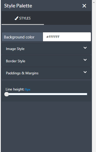
The Style Palette enables you to customize and format the elements blocks and cards used in the canvas area.
| Element | Description |
|---|---|
| Background Color | Allows you to set background color of the text. Note : This option is displayed on selecting a text element. |
| Image Style | Allows you to set image style (i.e Height in pixels and width in percentage) Note : This option is displayed on selecting a image element. |
| Border Style | Allows you to set the width, radius and color of the selected text. |
| >Border width | Drage to set the border with of the text box |
| >Border Radius | Drage to set the radius of the text box |
| >Border Color | Allows you to set the border color of the text box |
| >Border Style | Allows you to set the border styple. choose a style from the dropdown. |
| Padding & Margins | Allows you to set the margin and paddings for the text. |
| >Padding top | Drag to set at the text padding above the text. |
| >Padding right | Drag to set at the text padding right to the text. |
| >Padding bottom | Drag to set at the text padding below the text. |
| >Padding left | Drag to set at the text padding left to the text. |
| >Margin top | Drag to set the top margin of the element |
| >Margin right | Drag to set the right margin of the element |
| >Margin bottom | Drag to set the bottom margin of the element |
| >Margin left | Drag to set the lef margin of the element |

Source Mode
In this mode, you can enhance or modify the HTML code that may have come from an external party. It helps user customize the templates that cannot be done in graphical mode. All the edits in the source mode can be previewed, cleared, viewed or saved.
Click the Toggle Switch to enable/disable the code window.

Updated over 4 years ago